
Apple’s still pretty new to this whole public beta thing, but that didn’t stop it from dropping two consumer previews today. We’ve already taken a closer look at Apple’slatest desktop OS, so it’s high time we dug a little deeper into what it’s like using an early version of iOS 9. Spoiler alert: It’s pretty damned solid.
Before we go any further, though, keep this in mind: As stable as the iOS 9 beta seems right now, it’s still not ideal for use as a daily driver. If you’re itching to taste the future, you might want to use a spare, sacrificial iDevice just in case. I’m testing this build on an iPad Air 2, which has a few tweaks that won’t show up on the iPhone, so I’ll flag those when the time is right.
First look at iOS 9


If you’ve used an iOS device in the past two years, the post-install setup process won’t present many curveballs. The biggest one ties into Apple’s push for greater mobile security this year: If you prefer to lock down your iDevice, your passcode will need to be six digits instead of four. Restoring your settings from an existing iOS backup lets you keep your four-digit code by default, but it doesn’t look like you’ll get the option to create another short code if you ever decide to change things up. Security side note: iOS 9 also brings support for two-factor authentication, just to make sure no one’s futzing with your gear without permission.
Once that’s all done, you’re dropped right into the familiar iOS home screen… except it might not look as familiar as it used to. True to its word, Apple has swapped the lithe Helvetica Neue as the system font with the chunkier San Francisco typeface that debuted on the Apple Watch. If you’re a word nerd like me, you might find the change a little jarring at first, but it quickly becomes obvious that this was the right move; text looks fresher and more spacious than it used to.
Right, now that we’re fully set up, let’s do some more digging.
Getting your productivity on
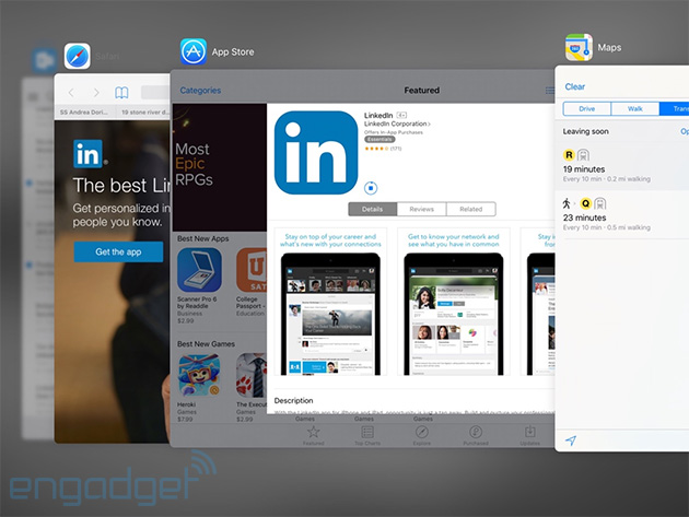
Go ahead, double tap that home button. It’ll bring up the revamped app switcher, which layers cards on top of each other so you can see more of them from the get-go. It’s a minor change, for sure, but it does mean you can kill, jump into or escape an app just a little faster than you could before. Of course, now we can do more than just jump between running apps.
If you’ve got an iPad Air, Air 2, Mini 2 or Mini 3, you can swipe over from the right edge of the screen to bring up the Slide Over menu. You’ll be treated to a vertical list of Apple-only apps that you can run within that window. You probably won’t use these for that long, though: The focus shifts from the main app to the one running in miniature, and they’re best suited for handling quick tasks. Want to see an iMessage thread before you respond? Or get a quick dose of news while you’re pecking out an email? Slide Over’s going to be your buddy.
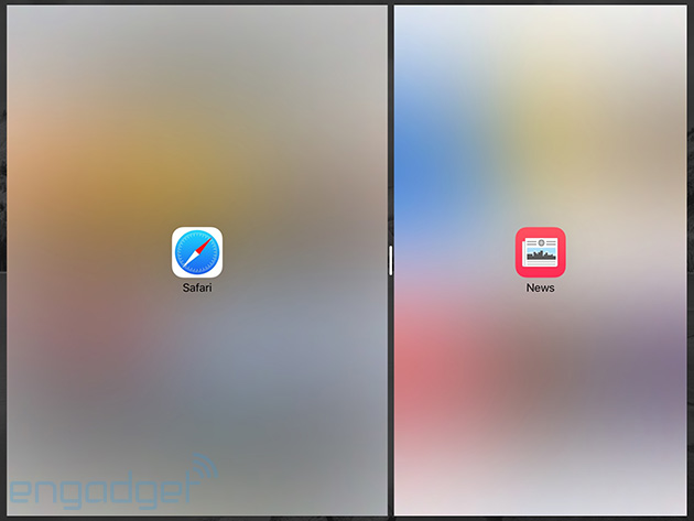
Assuming you’ve got the right hardware, you can pull those apps over to run split-screen with the app you were originally using. Well, sometimes, anyway; you can’t split-screen an app while you’re in Apple Music, for example. It takes a little time to get used to the gesture, but it’s fast, fluid and you’re able to fiddle with both apps simultaneously. (A bummer of a reminder: Those split-screen views only work properly on the iPad Air 2.) The only time that really changes is when you need to type something, as the keyboard spans the length of the screen. Speaking of the keyboard, the version we’ve got on the iPad is much smarter than it used to be. There are finally some discrete cut, copy and paste buttons so we don’t have to touch-and-hold-and-wait like we used to, and swiping two fingers together across that sea of keys lets you precisely place the cursor. Hallelujah.
A smarter iOS
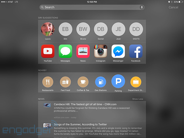
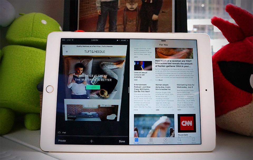
Apple was awfully fond of the word “intelligence” when it first showed off iOS 9 and you’ll start getting a sense of how much contextual awareness is at play when you swipe to the left from the home screen. That will bring up a dedicated search screen that offers up suggestions for who to talk to and apps you might need at this very moment. A handful of news stories (from the new News app, more on that later) sits below that, as do buttons that’ll display nearby restaurants, movie theaters and stores. It’ll probably take some time for these disparate mechanisms to really crack my daily routine, but it seems clear Apple wants you spending a lot of time here.
Siri’s gotten a bit more capable too, since she (or he depending on your locale) can handle more complex questions and statements. We got a peek at these smarts with iOS 8.4, where Siri correctly played the top songs of 1988 for me, but she now does a great job of ferreting out my photos from Hong Kong — or Thailand, or Pittsburgh, or wherever — when I ask. Asking for reminders when I’m halfway through an article in TheNew York Times or sifting through messages is super helpful, too, since Siri can figure out what I’m looking at and file it away for when I have more time.
Maps
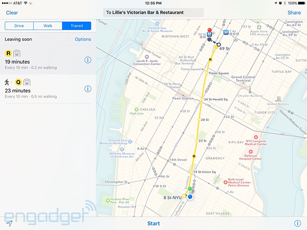
Remember the days when Apple Maps used to be a laughingstock? We’ve come a long way, and with iOS 9, it’s finally getting one crucial piece of the puzzle for city-dwellers: transit directions. It used to be that you could only get driving and walking routes (along with the healthy warning for the latter) but so far, Maps is just peachy when it comes to planning out routes criss-crossing Manhattan. This bit strikes pretty close to home for me: As a suburban New Jerseyite, I have a pretty terrible grasp of New York City’s subways and buses, so dead-simple transit instructions mean a lot to me. It should be noted that Google Maps is wonderful at this, but Apple Maps is finally starting to close the gap.
New and familiar faces
The biggest of the new preloaded apps is basically straight out of the oven; News first went live in the third iOS 9 developer beta, which dropped all of 24 hours ago. Considering the work that goes into building a news-reading platform from nothing, it’s not a surprise we’re only seeing it now, or that it’s not all that pretty yet. Actually, let me rephrase: Some of the stories look great, as a handful of news providers have been working with Apple on a handsome design format. The ones that don’t however, are often just a headline and some body text (at least, that’s how Engadget’s stories look). Still, you can tell there’s something important brewing here: It offers some solid-looking stories right out of the gate, and there’s plenty of depth when it comes to choosing your go-to news sources. It might just seem like a Flipboard clone for now, but I suspect the finished product will be worth keeping an eye on.
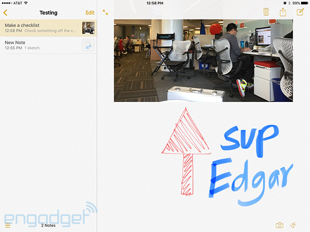
Meanwhile, the formerly no-frills Notes app has finally gotten some attention. It still works exactly the same if you want it to, but you can now add checklists and photos if you’re particularly fastidious. Hell, you can doodle diagrams right in your notes too; a three-finger swipe to the left undoes the latest stroke, while a swipe in the other direction brings them back. Sure, you could just hit the undo/redo buttons at the top of the screen, but where’s the fun in that? Alas, there are no brush size controls here; what we’ve got will do just fine for some off-the-cuff flowcharts.
Oh, remember that Podcasts app that plenty of people hated? It got a nice, flat, spartan sort of facelift, though it doesn’t seem like enough of a change to lure me away from the epic PocketCasts. Speaking of audio, the public beta also comes with Apple Music (which we’ve already dissected pretty thoroughly). The biggest difference? All that extra screen space on the iPad means Apple could squeeze in a separate area for your playlists so you’re not forever swiping right from all your tracks.
And all the other bits:
There’s a lot more to iOS 9 than just the flagship features, so here’s a quick run through what I’m most fond of:
- iPhones get a low-power mode that’ll throttle performance when you need more juice. Sadly, this doesn’t seem to exist on the iPad.
- The default folders in the Photos app now include one strictly for selfies!
- If you jump into one app from another, the signal indicator in the top-left corner of the screen becomes a shortcut to where you came from.
- You can search for items within the Settings app, in case you can’t suss out what you’re looking for normally.
In the end…
You don’t need me to remind you that iOS 9 isn’t ready for the masses, but here’s the thing: It feels pretty damned close. Even the mildly brave could go on an installing spree and be spared any game-breaking flakiness. Unlike the scattershot, hodge-podge feeling I got from Apple Music, this far-from-finished version of iOS 9 already feels focused and elegant. Does it add features we’ve never seen before? Not really, but it goes a long way in making iOS as a platform feel more complete, and for that, Apple deserves some kudos.


